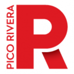
This past May, the Pico Rivera City Council unanimously adopted a new City Ordinance introducing a modern logo as part of the City’s rebranding efforts. The new logo reflects the rich heritage, natural environment, and forward-looking vision of the City while conveying its vibrant and energetic identity.
Establishing a new logo, the Master Plan will also explore alternatives and outline short-to-long-term strategies to implement new citywide signage and street furniture including street signs, wayfinding, monuments, gateways, and future development.
This new look will also be used on City property, such as benches, garbage receptacles, bus shelters, parklets, kiosks, and more. The overall goal is to create a sense of place that inspires community pride while continuing to revitalize the City. City officials expect to complete the Master Plan by early 2026.
With input from the City’s stakeholder advisory committee, local business groups, city commissioners, City staff, and the City Council, the project team created a wide range of options that integrated iconic City features and symbols. After an
extensive discussion and collection of ideas, it was determined that the two rivers – the San Gabriel River and the Rio Hondo – best represent the history, present, and future of Pico Rivera. The resulting final logo prominently emphasizes the significance of the rivers.
The designated Council Ad-Hoc committee offered further refinements and from there, recommended the final new logo design for approval by the full City Council.
“We’re excited to bring this new logo to our residents as it represents many elements of the City that residents can relate to,” said City Manager Steve Carmona. “The new logo also provides an opportunity to modernize the City’s marketing efforts in promoting the City to the region and coming soon, to the entire world.”
With global events such as the 2026 FIFA World Cup and the 2028 Olympic and Paralympic Games, hosted in Los Angeles. These logos will be phased out and formally retired.
It’s important to note that the official seal of the City of Pico Rivera remains the same and will continue to be used by City staff and authorized designees on all City communications. As a result of the new logo, City officials decided to update the City’s Municipal Code about usage and protection of the City seal to prevent unauthorized use or alteration.
To learn more about the new City Logo and it’s proper uses, visit picorivera.org/city-seal-logo/
The Meaning Behind the Logo
With the adoption of the ordinance, the new logo has three variations to be used on various City marketing efforts and signage. All iterations of the logo share the same font, color, and design elements for a consistent look and use throughout the City.
The two waves in each design variation represent the rivers surrounding the City. The blue in the waves symbolizes the flow of water and energy, while the gold represents the sun’s reflection in the water. The circular motion of the waves represents the cycles of life, the continuous flow of energy, and a focus on sustainable use and reuse. The circular motion also embodies the concept that “everything old is new again,” thereby emphasizing the City’s history, current, and future environment.
The end result is a composition full of strength that seeks to accompany the City in its constant growth.